Zephyr Notting Hill London
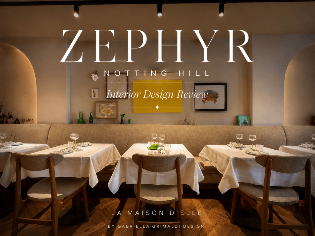
Zephyr
Interior Design Review
Overall: 6/10
Zephyr has a lot going for it — the food was delicious without a doubt, the open kitchen is a lovely feature, and the bar has an atmosphere and design that I really enjoyed. But from an interior-design perspective, I think there are a few things that could have been pushed much further.
The Main Space
There is, unfortunately, a little too much wood. For me, it starts to feel more like a barn or a traditional log cabin than a refined restaurant.
I also don’t think the Art Deco-style lights quite work with the rest of the space. They feel slightly disconnected from the overall design language.
That said, I absolutely loved the open kitchen. It creates energy and makes the restaurant feel more interactive, which works beautifully in a dining environment.
The Bathroom
The toilet is giving me Dorothy from The Wizard of Oz — yellow tiles from top to bottom.
But actually, I appreciated the atmosphere in here. It’s always a good idea to create a bathroom that feels considered rather than like an afterthought.
I also liked the fact that the sink, soap and hand cream were all integrated into the experience, and the quality of the products was noticeable. Even the hardware were good quality.
One thing I would change? Match the color with the lighting outside, burgundy or deep purple tiles would work amazingly.
The Bar
The bar was probably my favourite area design-wise.
I really enjoyed the atmosphere and the overall design. Unfortunately, the cocktail I had wasn’t quite as impressive — but design-wise, I can’t fault the space.
One thing I would change? Extend the mirror across the entire wall. It would immediately make the space feel larger and more intentional.
What I Would Change
If this were my project, I would make a few key changes.
1. Replace some of the wood with stone or stone effect.
I would introduce an off-white stone and make it feel as authentic as possible. This would immediately elevate the space and create more of that refined Mediterranean feel.
2. Rethink the lighting.
For the decorative lighting, I would look at Gergei Erdei. I think something more sculptural and contemporary would sit beautifully within the space.
3. Make the niches more interesting.
Rather than leaving them relatively quiet, I would introduce sculptures and backlighting. This would create depth, atmosphere and beautiful focal points in the evening.
4. Keep the stone-like decorations and artwork.
I actually like these elements and think they contribute to the identity of the restaurant.
However, I would remove the more modern vases and replace them with authentic pieces sourced from Greece or Italy. The space would benefit from objects that feel collected rather than simply selected.
5. Reupholster the seating.
The grey upholstery would definitely be one of the first things I would change. I would introduce a warmer, richer colour to bring more personality and softness into the space.
And the pendants? I need to think about those. I do not dislike them but not sure how would they go with the new concept.
My Verdict
I love pieces with soul and history. I miss it here. For me it is a must to add.
Zaphyr has a strong foundation. The food is delicious, the open kitchen works beautifully, and the bar has a great atmosphere.
But aesthetically, I think the restaurant is caught between several different design directions. With a little more editing — less wood, stronger materiality, more authentic objects and a more cohesive lighting scheme — it could feel significantly more sophisticated.
6/10 — delicious food, lovely atmosphere, but the interiors need a little more editing.
Listen to the Podcast Make Room For Her:


Leave a Reply